Adding colour to the virtual skies
A look into the work and background that goes into creating and designing Fly UK's liveries
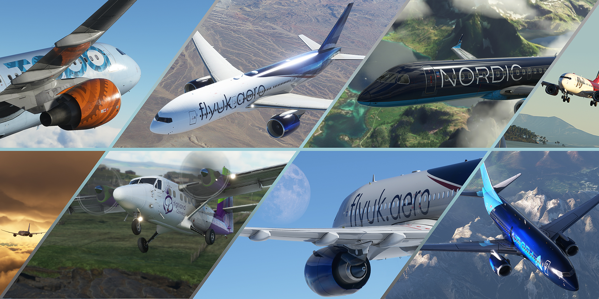
Behind every great airline, virtual or real world is a great brand and identity. Airline liveries have evolved over many years and all aviation fans will have their favourite colour schemes special to them be it modern or something from the past. In this article we take an in depth look at our VA livery history, what goes into our livery designs and how they make their way into the sim, it's no easy task we can assure you!
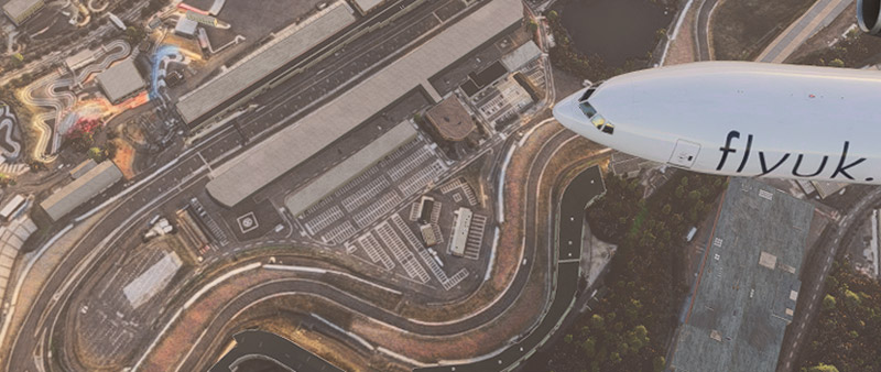
Here at Fly UK, our identity and colours are flown proudly and have seen a design journey over our 18 years that has evolved more than some real world airlines. Our current “Crystal” Fly UK livery was introduced in 2019 and is our 7th livery to grace our airframes (not including our franchise divisions). By comparison the current British Airways “Chatham Dockyard” livery traces its roots to 1997 so has been in service for over 20 years.
Along with livery quality, Flight simulation has greatly improved in the past 20 years to the point some of today's screenshots are hard to separate from reality. This can be seen in the evolution for Fly UK designs over the years and the demands placed on our designers and artists.
Fly UK Livery evolution

There have been quite a few different variations of the Fly UK livery since we started in 2004. Initially one of our major problems was finding a painter to repaint the entire fleet in the same livery. The first two liveries never appeared on all our aircraft as a result. The second livery only ever appeared on our B757-300 aircraft. The first fleet wide livery to appear on all our aircraft was the 2005 livery but that had a short lifespan. In 2006 the Union Spirit livery was introduced and became the mainstay of Fly UK with minor modifications over the years with changes including the 'flick' from the front of the aircraft removed and billboard style titles.
Union Spirit livery arrived in 2006 although itself went through many revisions with changes including the 'flick' from the front of the aircraft removed and billboard style titles. Union Spirit became the mainstay livery for 10 years with a major update in 2014 to a more minimalist version of the Union Spirit design, this scheme lives on today in our Cargo division.
And we then reached where we are today, a little by accident. Union Spirit had served us well for 13 years when in 2019 we introduced a special livery to celebrate Fly UK’s 15th anniversary. For those that know their list of traditional anniversary gifts, 15 years is Crystal so a special design was created with this in mind and featured on a select number of aircraft starting with the 787 which was one of our first aircraft to feature PBR technology. The response to the livery was overwhelming with many members asking us not to retire it after the anniversary period was over and as such the repaint team undertook the largest repaint project the VA has seen to rebrand the entire fleet which was announced at Cosford Flight sim show October 2019. We’ll dive deeper into how this livery was created later in the article.
Franchise liveries
Our Franchises also have a rich history, Fly2 has evolved the most and this can be seen in a previously published blog here. Thanks to Steve Trueman and Matt Lewis, our current franchise identities are strong and aside from minor evolutions, have stayed steady. Themes and inspiration for these franchise designs come in many forms but below we'll give you a little insight how the designs were inspired and what they intend to represent.

Nordic Sky
The dark blue represents the Nordic night sky with the accents of blue and white highlighting the stunning terrain of Norway.

Topa Sky
Drawing inspiration from the South Pacific and New Zealand area, “Topa” is the Maori verb to “soar/fly” and the livery design is intended to reflect this with the sky blue colour / cloud base as well as traditional Maori design on the engine and tail. The rear fuselage pattern is inspired directly from Maori art of a bird's wing.

Fly2
The current design builds on the franchise historical red base livery and is intended to stand out in the holiday/leisure flight sector it is focused on. The tail design is based around a stylised number two with brighter red accents to make the livery stand out.

Highland Connect
Launched in 2012, Highland Connect started out using the standard Fly UK livery before changing to the bespoke plain white livery with the prominent thistle logo and purple and green highlights franchise livery in 2013 as a. The livery later evolved to make greater use of bold colours based on the original accent scheme. The Purple and green design reflects the classic Highland landscape of green grass and purple heather.

Aurora
Our most recent division takes clear and direct inspiration from the Canadian and Alaskan skies its name relates to. A bold design based around the blues, greens and purples associated with Aurora Borealis makes for a simple but striking design.
The different colours on different airframes is inspired directly from Braniff and Court Airlines of the 1970’s. Although the green and purple colour options are not available on all Aurora airframes, our Twin Otters and RJ100’s come in the full range. Blue fast became the preferred members choice so this is reflected across the larger portion of the fleet.
So what goes into a virtual airline livery design?

The luxury of VA livery design is freedom to come up with unique and compelling artwork without a lot of hurdles. The process can be as long or as short as you make it but in the virtual world, there is less need to go through rigorous hours of consumer feedback, board approval, accountants etc. That said there are some important factors to be taken into account..
Branding reflects the identity - As highlighted above all of Fly UK’s divisions have liveries that reflect their names and identify. The design should always link to this important topic to give a depth to the overall experience. Fly UK for example reflects the national flag colours, if we ever did a Fly Germany in theory….you’d expect a similar theme.
Design complexity & Aircraft paint kits - Drawing a 2D design on a blank canvas is all well and good but in order to translate this into texture files on a 3D model, consideration has to be given to often complex paint kit template layouts. Some are very nice to work with, others a complete nightmare but normally the more complex the livery, the harder it is to translate to in sim textures. Complex patterns across fuselage joins and gradients are the number one enemy of the simulation texture artist.
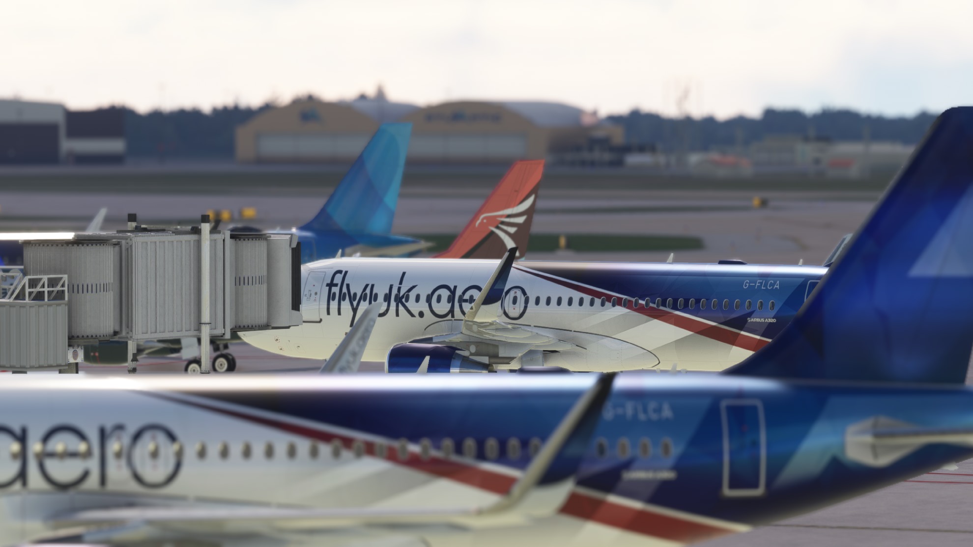
Final feel and presentation - fictional simulation liveries come in all shapes and designs that you would never see in the real world. For Fly UK it's important to reflect on any livery and ask the question “ would this work in the real world?” The test here is a screenshot of one of our aircraft surrounded by other real world liveries at a busy airport and asking ourselves, would that fit in if it was real?
So where do we start and how do we come up with a design….lets take you on a journey through the livery design of our “Crystal” design and how it makes it to the sim.

Design
As part of our 15th “Crystal” anniversary, a special livery was one of the suggested ways to mark the occasion. Designed by Matt Lewis, the end product needed to remain distinctly Fly UK but stand out enough from the existing livery.
The key elements decided upon were therefore,
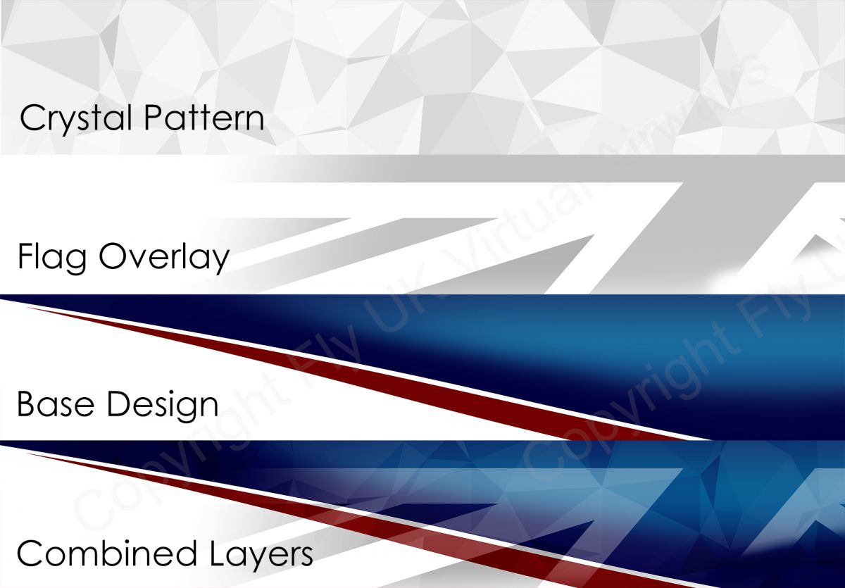
- Retain the Red white and Blue associated with the UK.
- Incorporate the flag design.
- Incorporate the Crystal pattern.
Various test examples were run though before the final design you see today but the end result is a clever blend of the following key layers built with Adobe Photoshop.
Applying a design concept into a flight sim
Next we work on getting this design into the simulation. Techniques are relatively common across flight sim products albeit with some small intricacies, however once learned the basics can be carried over relatively easily. We often get asked how we go about this and the truth is practice, patience and a lot of knowledge with a good artwork program such as Photoshop. Other methods are coming to the fore now with MSFS such as painting within a 3D program such as blender, however the finishing touches almost alway require a Photoshop type of program.
Aircraft texture files can come in many different ways and are never one single texture file. Generally the more complex the aircraft, the more files but for the purposes of this we’ll keep it to a relatively easy and well laid out example.
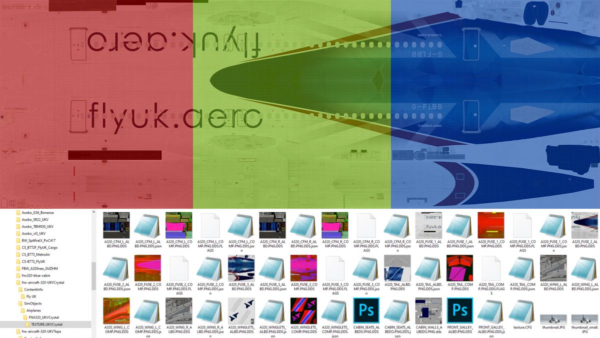
The best aircraft devs will give a full paint kit with a complete fuselage body template that allows you to place the whole design together as shown above, before breaking it down into separate texture files. The red, green and Blue section on the example shown is from the Fenix A320 highlights the breakdown of the master template sections into the texture files which are always a perfect square size, 2048x2048 pixels for example. Most commonly an texture folder will have the following files,
- Front Fuselage
- Mid Fuselage
- Rear Fuselage
- Tail/Stabiliser
- Left Engine
- Right Engine
- Wings
There may be more of course, we include a few little cockpit extras in our MSFS FBW for example.
Once the master is broken down and saved into the individual texture file then we can start to load into the sim. This is where the most frustrating part of the process can come in as it can require hours of trial and error to tweak and change small areas, especially if the painkit is not perfect. A change on one texture alignment can knock onto another, particularly over model join seams. It can often take hours of tweaking, loading and reloading of the sim to get right. To put this into context, our recent livery for the Fenix A320 took about five hours to perfect, this is relatively quick. Some products with poor paint kit layout have taken over 50 hours of work time to get right.
For those interested to see the full process in accelerated timelapse, try this video showing the creation of an SAS livery in XP11.
Finishing touches and effects - PBR
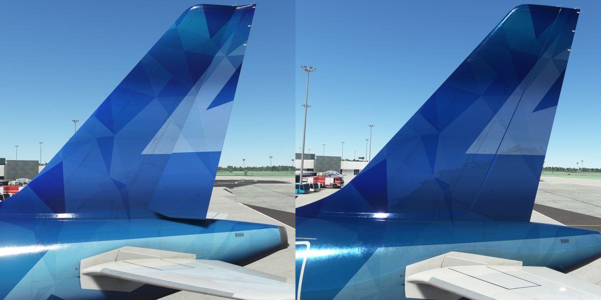
In recent years the simulation world has started to embrace PBR which is Physics-Based Rendering material, is a virtual material pipeline that can simulate any kind of physical material to particularly improve a 3D model. This has given sim livery designers the creative ability to accurately and easily paint aircraft surfaces to give matte dull finishes, vinyl sheen effects metallics and chrome. Prior to this innovation if you wanted to make a classic American Airlines livery, the artist would need to paint a static chrome effect on the fuselage which gave a “metallic” appearance in the sim. With PBR this is no longer required as the artist can use a simple plain texture but then tell the sim to display its metallic or chrome texture via an additional texture file. In the American Airlines example you go from a fake static chrome texture to one that actually behaves as chrom and reflects the live work around it as the aircraft moves.
For our Crystal livery, we make use of PBR to make our design pop out a little with mild metallic effects, the with (right) and without (left) PBR can be seen below.
What's next for Fly UK liveries?
Back in the intro we mentioned the transition to the crystal livery scheme as one of our biggest paint team undertakings to date. Our thanks to Matt L, Matt C who covered FSX/P3D and recently MSFS and Dmitriy Kozyrev on XP11 who undertook this massive process. To put into context, a total of 14 airframes underwent new livery painting across four sim platforms. Break that down into multiple products including freeware and payware and the size of the task grows further. Since the transition to Fly UK Crystal, a total of 137 livery packages have been produced by the team. Factor in time it can take mentioned before and the scale of the undertaking becomes clear.
A number of members present and past have been behind the designs of Fly UK with the current designs the handiwork of Steve Trueman (Nordic, Highland Connect, Cargo) and Matthew Lewis (Fly UK, Fly2, Aurora, Topa Sky). We thank all our staff (past and present) who have contributed to Fly UK's colourful impact on the virtual skies, the roll call includes
- Kenny Dowling
- Lee Appleby
- Ian Cumming
- Steve Trueman
- Dmitriy Kozyrev
- Matt Lewis
- Matt Crick
And of course thanks to all our members who make the hours spent worthwhile for great feedback and flying the colours proudly.
A great livery can serve well for a long time, we feel we have that right now so you can expect little change on our schemes for now, instead we focus on other areas of branding and design to compliment the Fly UK experience, we hope you'll enjoy what's to come!

Comments
This is a community-moderated forum.
All post are the individual views of the respective commenter and are not the expressed views of Fly UK Virtual Airways.
By posting your comments you agree to accept our Terms & Conditions.


